
KYC is brokenfor Indian users.
Every fintech app asks the same KYC questions. The average user has answered them six or more times across different apps. It takes 5 to 7 minutes, requires documents on hand, and still fails if one field mismatches a government record.
Cashfree had years of verified identity data from government and financial sources. The question was whether that could become a product that helped users, not just businesses.
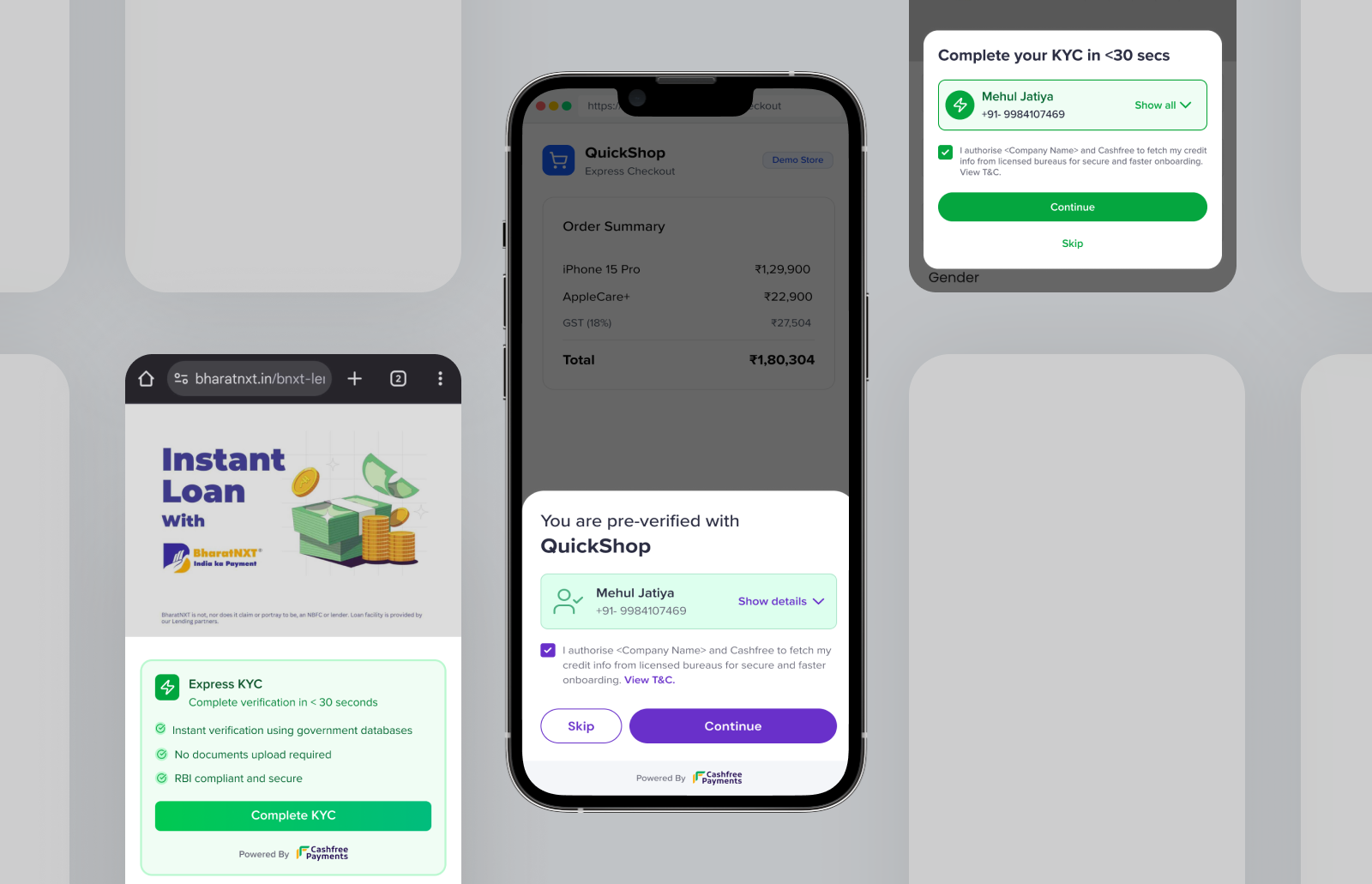
One phone number.Everything else, pre-filled.
Three actors.One seamless handoff.
What feels like one tap to the user is a seven-step handoff across three actors.
Why would a Dream11 usertrust Cashfree?
A Dream11 user has never heard of Cashfree. Suddenly an overlay shows their name, PAN, address, and bank details pulled from a service they don't recognize. The data is legitimate. But to the user, it looks like a breach.
The risk was never technical. It was psychological.
A consent screen stating the partnership, source labels on every field, and full controls to edit or skip any data. It helped. Not enough.
01, Consent & authentication

02, Data review & confirmation

Two versions.One underlying lesson.
A Cashfree-branded overlay inside Dream11's app. Users verified via OTP, reviewed pre-filled data, and submitted. It worked technically. But users balked at seeing an unknown brand name holding their personal data. The OTP felt redundant too since Dream11 had already logged them in.
Finding: The problem wasn't the data. It was showing an unknown brand inside a trusted app.
The call to rebuild came from the pilots, not a design review. Merchants running V1 weren't seeing conversion move. Two signals kept coming back: users were being asked to authenticate twice — once with Dream11, once with Cashfree — and the second auth was killing drop-off at exactly the moment the product was supposed to reduce it.
This project was our recommendation to build in the first place — mine and the PM's. So when the pilot data came in flat, we didn't wait for a management call. We made the pivot decision ourselves in under a week. There was internal pushback on making Cashfree invisible — removing our branded layer felt like giving up real estate. My position was straightforward: user trust comes before brand presence. A frictionless experience that works will do more for Cashfree's reputation than a logo on a screen users distrust. That argument landed. Seven days later we had a working prototype that proved it.
Merchants gave us two clear signals: duplicate OTP is friction, and any extra screen kills conversion. So we eliminated both. Merchants now pass their auth token directly to us, satisfying DPDPA compliance without a separate Cashfree login. And instead of our own overlay, a small banner lives inside the merchant's existing form: "Fill instantly using your verified data." One tap, the form fills. Cashfree is never seen.
Finding: The best identity layer is one users never notice. Auth passthrough handled compliance. Native pre-fill handled perception.
Auth and consent both passed by merchant. Cashfree never surfaces to the user.
Value proposition and trust markers shown first, then KYC fields fill automatically.
More prominent flow where the user reads and takes action themselves.
We didn't validate in a lab.We co-built with the actual customers.
Every design shift came from working sessions with the merchants putting this in front of millions of users. They showed us their actual drop-off data and told us directly where our solution would fail.

Fantasy sports, mobile-first, high volume. Speed of onboarding directly impacts activation.
Brand confusion and OTP friction drove the V2 direction.

Tax filing. Users are cautious about sharing financial data. Unknown brand names in the flow are a dealbreaker.
Confirmed that invisibility, not polish, was the answer.

MSME loan KYC. Business owners expect zero friction and complete clarity on data handling.
Their drop-off analytics closed the internal debate on removing our surface.
The hardest constraintswere legal, not technical.
Several of the most important design decisions in this product were made in rooms with data security, legal, and compliance teams, not in Figma.
India's data protection law requires explicit consent before any personal data is fetched. Not a checkbox, it defines the sequence of the entire flow.
Merchants pass their auth token to us as a compliance record. The design challenge was making a multi-party technical handshake feel like a single, simple consent moment to the user.
Not every number returns a full profile. The flow had to show found data clearly, surface gaps without confusion, and let users fill missing fields inline. The 15% exception case needed as much design attention as the 85% default.
V1 ran inside in-app browsers, which have limited JS and inconsistent Android rendering. Every state had to be designed for that constrained environment before a native SDK existed.
From a 7-minute formto a 30-second confirmation.
Now live as part of Cashfree's Secure ID suite on Web, Android, and iOS. The merchant co-build model is what made V2 possible. No internal workshop would have produced the conversion data that justified removing our own surface from the flow.
Sole designer.Full scope.
I owned this end to end. In the room for feature scoping, merchant research sessions, and compliance reviews. The two versions weren't planned. They emerged from building, presenting, and getting pushed back on. V2 didn't exist when V1 was in Figma.
I'd start the merchantconversation earlier.
We knew brand trust was a risk and addressed it reactively. Earlier consumer research on Cashfree's brand perception would have gotten us to V2 a full iteration sooner.
Early sessions were demos. Later ones became co-design. That shift happened too late. Structured merchant input from week one would have made V2 the starting point.